Tools used: Python, Dash
This is a project using Python and Dash, from Quantium's software engineering job simulation.
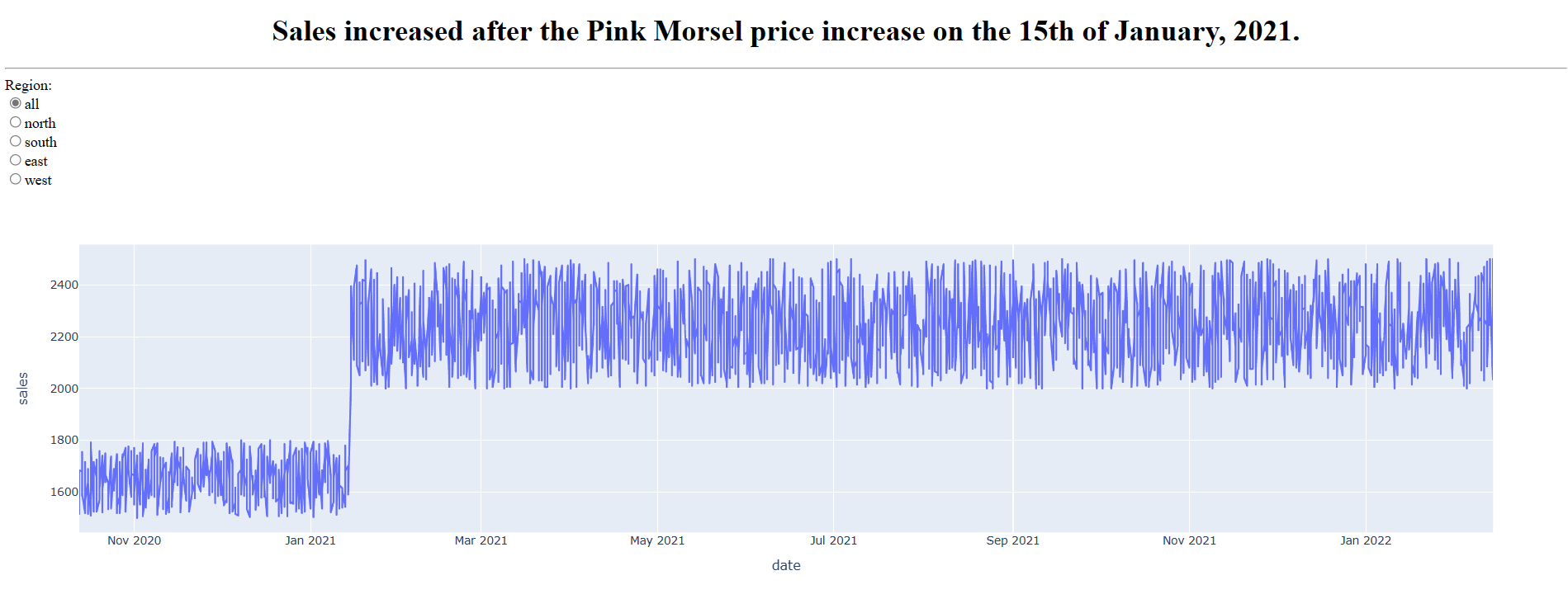
The client, Soul Foods, has observed a decline in sales on their top performing candy product and would like to find out if their sales were higer before or after the Pink Morsel price increase on the 15th of January, 2021. They provided three CSV files containing transaction data for their entire morsel line for 2018, 2019, and 2020. Each row indicates the quantity of a given type of morsel sold in a given region at a given price on a given day. The five data fields are "product", "price", "quantity", "date", and "region".
Data processing
Soul Foods is only interested in Pink Morsels, so rows containing other types of products were removed.
Since Soul Foods is interested in the total sales for a given day, the "price" and "quantity" fields were combined into a single field, “sales,” by multiplying them together.
The python code below was written to convert the three files into a single formatted output file. Only the three relevant fields "Sales", "Date", and "Region" were retained.

Visualisation
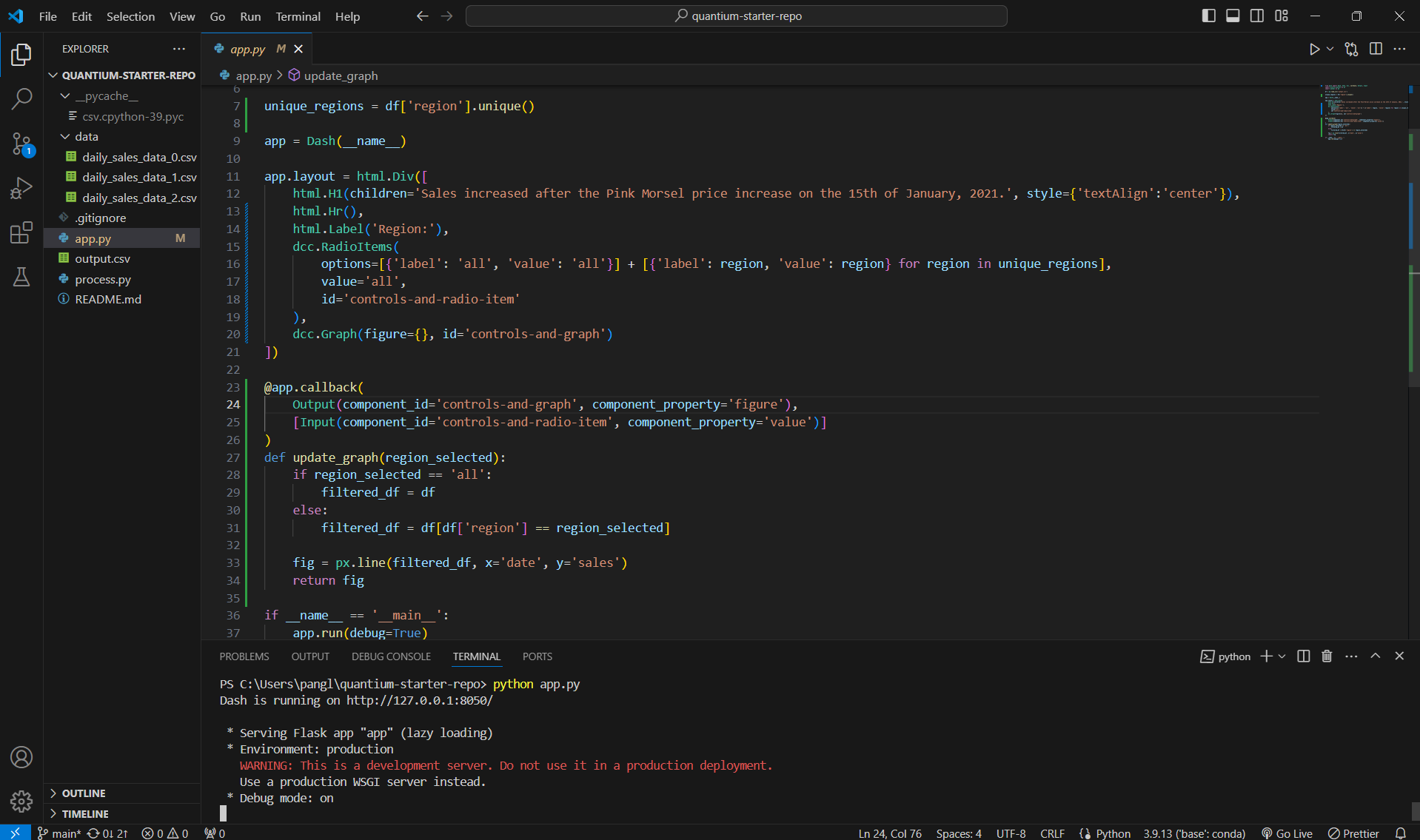
A Dash app was created to visualise the data. The application incorporated a header and a line chart which visualises the sales data generated in the last task, sorted by date. The goal of the Dash app is to answer Soul Foods’s question: “Were sales higher before or after the Pink Morsel price increase on the 15th of January, 2021?”
A radio button was added to allow Soul Foods to dig into region-specific sales data for Pink Morsels.